http://www.corporate-eye.com/blog/2012/08/2016-rio-olympics-logo-an-improvement-over-london-2012/?
See the video of the making of 2016 Olympic Games
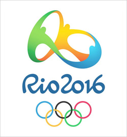
The logo for the 2016 Olympic Games in Rio was unveiled over a year ago, but it’s back in the news following the 2012 Games in London. Unlike the buzz around the London Olympic Games logo that was primarily negative (I wrote about it not once buttwice in 2007), the buzz around the Rio 2016 logo has been fairly positive lately. http://www.corporate-eye.com/blog/2012/08/2016-rio-olympics-logo-an-improvement-over-london-2012/? See the video of the making of 2016 Olympic Games
6 Comments
22/7/2013 07:39:55 pm
Thanks for posting the logo of the Rio Olympics. The world is waiting for this great sport show as well as me. It is nice that it is happening in a Latin American country and love to be there in Brazil during that time. Great post and thanks again.
Reply
30/12/2015 02:03:05 am
What a beautifully constructed logo. It has form and function and flows amazingly! Certainly a lot better than the London 2012 and the Glasgow Commonwealth logos. Combined.
Reply
29/4/2016 01:13:36 am
Looking awesome. I Hope the all teams will try their hard and we will have to see some healthy competitions.
Reply
4/5/2017 05:12:39 am
Well, it’s a nice one, I have been looking for. Thanks for sharing such informative stuff.
Reply
29/11/2017 09:39:52 am
This tour made them more popular among the followers. There are many people listening their new album.The information is needed for the next tour preparation.
Reply
19/2/2024 05:18:15 am
I have learned alot of things in this blog.This is really helpful and informative for me.
Reply
Leave a Reply. |
Archives
July 2014
Categories
All
|