
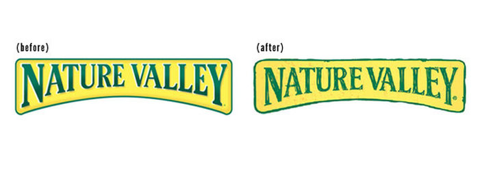
Nature Valley has undergone a brand revision to its logo that results in a subtle but significant change.
They have moved from the 3D metal plate look to a more hand drawn weathered look. This brings their logo in line with the hand lettered look of their packaging.
The new logo reminds me of the hand rendering we used to do when squeakers we the only tool available to render designs. I can imagine the client seeing the hand rendered logo and saying 'I love it' – 'thats just what we want'!
The new logo branding continues our society's current search for authenticity. It presents an image that is hand made and folksy. Which is how Nature Valley would like consumers to think of Nature Valley.
The need for authenticity is a deeply held response in our culture to the feeling of being set adrift from our roots. This is especially noticeable in the food and beverage area. Although we know that our consumables are produced in factories and on food farms we would like to think that they still grown by small holders or made in family businesses.
The new Nature Valley brand logo goes some way to maintaining this illusion in the mind of the consumer.
 RSS Feed