Follow the link below to find out how Circus du Soleil capitalise on their marketing.
Marketing nounce from the world's premier circus.
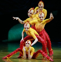
Staying on top with flexible response marketing. Follow the link below to find out how Circus du Soleil capitalise on their marketing. Marketing nounce from the world's premier circus.
9 Comments
I love this video from a stock footage company making explicit the feel good themes so common in corporate advertising. The report, released today by local service search website Oneflare details the 50 top performing local businesses for the third quarter of 2013. Oneflare pulled data from over 35,000 Australian service providers to provide analysis of all job requests made during the period July to September this year. The Oneflare top 50 jobs and growth by quarter are:
Sometimes I like to explain the difference between corporate identity and branding and this way… Corporate identity is the image of an organisation that is presented to the world. Whereas branding is the impression of the organisation that exists in the mind of the audience. The difference is, the first, is what an organisation puts out. Whilst branding is what is held in the hearts and mind of the intended audience. If you been watching TV lately you may have noticed the cleverly targeted and worded Chevron ads. This is pitched to appeal to the hearts and minds of the skeptical and present Chevron as the good guys who care for people and the environment. This post is not about the rights and wrongs of Chevron or mining. It's about taking a sentiment that exists in the community and addressing that sentiment by using the classic proposition of saying - 'we've got nothing to argue about' - 'we both agree' - 'I'm on your side'. After all that's how you win an argument - by neutralising the objection and emotion in the argument. In effect you are not converting your audience to change sides, as you are already on their side. The presentation is spot on - low key, with a folksy retro, hand-made look. The print ads even have endorsements from notable 'impartial' Australians. And as a brand designer, I can't help but admire the campaign. The new Yahoo logo is an interesting choice for a tech and communications company, demonstrating that when everyone is zigging it's time to zag. There is a lot that is retro about this design - the chiselled typestyle, the large and small caps. It is almost something Eric Gill would have approved of. (if you don't know of Eric Gill, think Gill Sans). It's as if Yahoo has moved it's identity from the fun loving 50's to the power dressing 80's. The old Yahoo logo brings to mind the popular afternoon TV shows from the 50's and 60's; The Flintstones, Top Cat, Leave it to Beaver, and Bewitched, while the the logo below is more Dynasty and Dallas. It signals the arrival of a corporate contender that's ready for business. In the video below it is interesting to view how this logo was constructed. But no amount of precise font construction can substitute for visual placement by eye, and there is something about the letter spacing and placement of the 'Y' that seems not right. More on the logo can be read here. Yes, you heard it here first. Shoalhaven Council are paying a consultant to develop a brand for Milton and Ulladulla."However Ms Watterson said she was keen to hear back from the wider community about any branding ideas. A mock up picture of a giant sausage on the poles at Ulladulla’s entrance recently generated plenty of discussion, and Ms Watterson said it was interesting to see the way people responded and the suggestions they raised. “It’s only when you put an idea out there that people suggest an alternative,” she said." Full story… The new Roxy women's surf ad has copped a lot of flack for being dumb and sexist. See JaneCaro's comment in Marketing Magazine where she labels the ad as sexploitation. After watching the ad it seems an over reaction to an ad carefully pitched to its target audience. One only has to watch any number of self produced youtube videos to see that many young women are choosing to represent themselves in a way that is sexualised. You tut tut and shake your head and say that this shouldn't happen. But it does. There is nothing that is especially offensive about the ad and it even manages to show range of summer beach wear. Perhaps what is more interesting is the additional product placement throughout the ad, I can only think that these companies are co-sponsors in surf comp. |
Archives
July 2014
Categories
All
|