
I love this video from a stock footage company making explicit the feel good themes so common in corporate advertising.
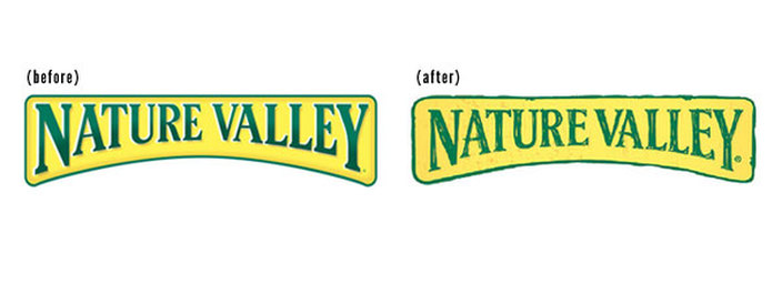
 Nature Valley has undergone a brand revision to its logo that results in a subtle but significant change.
They have moved from the 3D metal plate look to a more hand drawn weathered look. This brings their logo in line with the hand lettered look of their packaging. The new logo reminds me of the hand rendering we used to do when squeakers we the only tool available to render designs. I can imagine the client seeing the hand rendered logo and saying 'I love it' – 'thats just what we want'! The new logo branding continues our society's current search for authenticity. It presents an image that is hand made and folksy. Which is how Nature Valley would like consumers to think of Nature Valley. The need for authenticity is a deeply held response in our culture to the feeling of being set adrift from our roots. This is especially noticeable in the food and beverage area. Although we know that our consumables are produced in factories and on food farms we would like to think that they still grown by small holders or made in family businesses. The new Nature Valley brand logo goes some way to maintaining this illusion in the mind of the consumer. 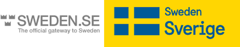 The new brand Sweden has been launched. And Guess what? It's the Swedish flag. The agency responsible worked for 2 months trying to find something creative and new that would connect to Sweden. And in the end they settled on the Swedish flag. Well, that was easy. Mattias Svensson, Creative Director at design agency Söderhavet, said “And we just kept coming back to the flag. The flag is a good anchor for the rest of the identity." With the logo out of the way, I can only think that the agency had to find something to bill all those hours for. So they created a new font, as apparently, there were no other fonts in the world that could do the job. So there you have it. Brand Sweden - the Swedish flag in a yellow box, and in case you were in any double the word Sweden next to it. That word 'Sweden' is going to be printed in the local language wherever the logo appears. Now there's an application nightmare in the making. Cost about 400,000 kronor (A$65,000)  Just as quick comparison shown here is the IKEA logo, which manages to say Sweden even without a flag.
I see the Sydney Opera House's Festival of Dangerous Ideas has rolled around again.
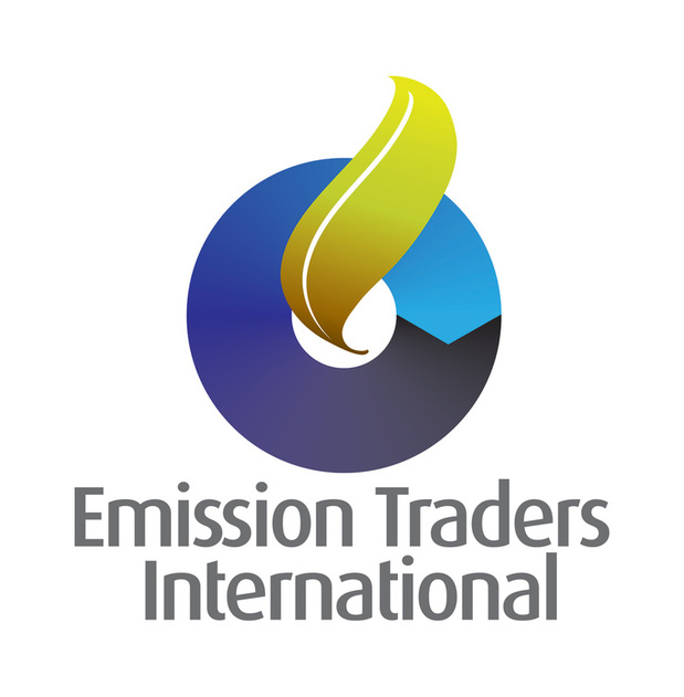
Does anyone really believe that this 'festival' is dangerous? The Opera House will present a number of personalities who are on the chat circuit who wil be spruiking their ideas on economics, gender, race, culture and sex. It's hard to imagine this chat-fest threatening anyone. Most who will attend will be well educated middle class citizens who can afford to be entertained for an hour or so by this promotional event. You don't need to travel far to find your own real festival of dangerous ideas. Just google a few key words like 'hate' 'immigrants' 'kinky' 'conspiracy' then drill down to a few blogs and chat rooms and you'll find plenty of danger lurking there. But for those who want to be entertained… http://fodi.sydneyoperahouse.com 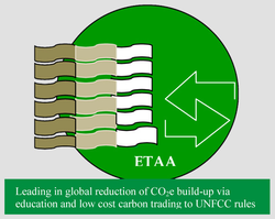 Recently we were asked to create a new logo for Emission Traders International. Their old logo was more of a diagram than a logo and would only be understood by the cognoscenti. Most people would have no idea about how emission trading works, but they would probably think the following
Our job as designers was to take that information and distill it into a symbol that represented the essence of what emission trading is all about. The final logo we produced symbolised the following information.
 Sometimes I like to explain the difference between corporate identity and branding and this way… Corporate identity is the image of an organisation that is presented to the world. Whereas branding is the impression of the organisation that exists in the mind of the audience. The difference is, the first, is what an organisation puts out. Whilst branding is what is held in the hearts and mind of the intended audience. If you been watching TV lately you may have noticed the cleverly targeted and worded Chevron ads. This is pitched to appeal to the hearts and minds of the skeptical and present Chevron as the good guys who care for people and the environment. This post is not about the rights and wrongs of Chevron or mining. It's about taking a sentiment that exists in the community and addressing that sentiment by using the classic proposition of saying - 'we've got nothing to argue about' - 'we both agree' - 'I'm on your side'. After all that's how you win an argument - by neutralising the objection and emotion in the argument. In effect you are not converting your audience to change sides, as you are already on their side. The presentation is spot on - low key, with a folksy retro, hand-made look. The print ads even have endorsements from notable 'impartial' Australians. And as a brand designer, I can't help but admire the campaign. 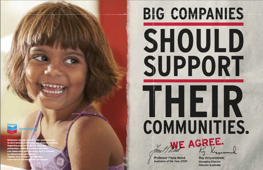 |
Archives
July 2014
Categories
All
|
 RSS Feed